Business case · UX, web design and front-end
TrueLayer press page
TrueLayer needed a Press page: one place collecting everything written about the company. I benchmarked how other companies solve it, reduced it to four things journalists actually need, then designed and coded the page.
- Type
- Self-directed business case, a brief taken on during a design selection process and run with my own method
- Scope
- Benchmark, content design, visual design, front-end build
- Built with
- HTML, CSS, Bootstrap, matching the existing site
- Audience
- Journalists and media
The brief
TrueLayer provides secure, global access to financial infrastructure: open banking plumbing that other fintechs build on. The task was to create a new static page for the website, called “Press”, collecting links to all the articles out there about the company.
This one is as much content design as interface design. A press page has a single job: stop a journalist from having to email you.
The process, and what was real
Empathise
Partly delivered- Benchmark of press pages across contexts
- Interviews with journalists covering fintech (proposed)
Define
Delivered- Four required content elements
- Anticipate everything the media might need
Ideate
Delivered- Page structure and grid
- Deliberate decision to omit pagination
Prototype
Delivered- Working page built in Bootstrap
Test
Method proposed- Findability check with journalists (proposed)
- Load-performance measurement at scale (proposed)
Benchmark, then reduce
Delivered
I started by analysing the same page type across different sites in different contexts, and concluded that four elements were needed. The goal was to anticipate everything the media might ask for.
- Contact information
At minimum, the email address of the person who handles media requests. Everything else on the page is worthless if a journalist on deadline cannot find a human.
- A quick company overview
Enough detail to grasp what the company does, without sacrificing clarity to length. A visitor should be able to describe the business accurately after one paragraph.
- Noteworthy media mentions
Interviews, quotes, awards, nominations, product mentions in notable publications: all worth linking. Detailing coverage positions the company as credible and newsworthy. The publication’s name has to be prominent, because people scan this page for quick hits rather than reading it.
- Media assets
Before writing anything, a journalist needs visuals, bios and links. The page should be the hub for the brandbook, the logos and the company blog, so nobody has to ask.
Design and build
Delivered
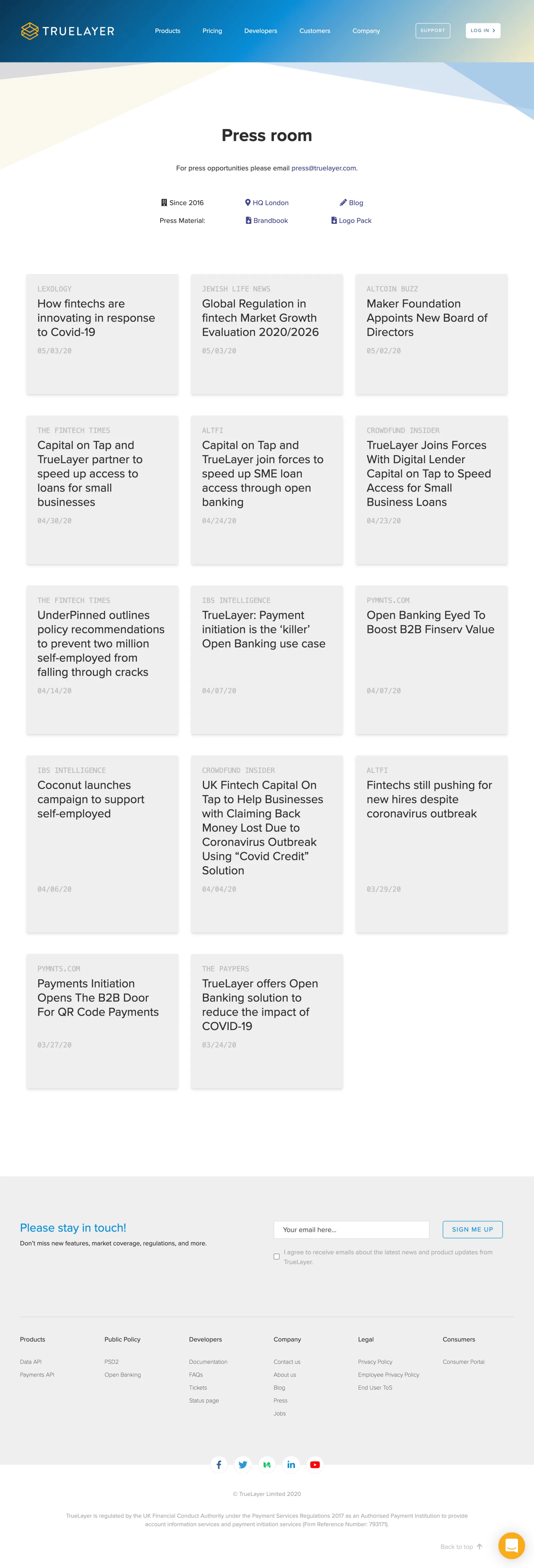
The result is a clean, informative page that simplifies discovery: it makes it easy for outside sources to recognise the brand publicly. It uses the site’s existing header, and puts the information useful to media immediately below it.
Then a grid of three items per row. Each item carries the publication’s name, the article title and the date, in that order, because the name is what a scanning eye is looking for. The hover animation is borrowed from the Customers page rather than invented, so the page belongs to the site.
I deliberately left out any “load more” button and any pagination. On a page this simple, loading performance is not affected and there are no further loads for the user to trigger. I kept the “back to top” button, which makes it easy to return to the most recent news. The page closes with the site’s standard footer.
For the build I used Bootstrap, partly because it was already in the site’s resources, and partly because it is one of the most complete and flexible libraries for this kind of layout.
Looking back
Method proposed written now, looking back: what I would keep and what I would do differently with the experience I have today
Arguing the case for no pagination is the part I would defend hardest. Restraint is a design decision, and it needs a reason written down like any other.
What I’d do differently: the “no pagination” call was correct at the volume of coverage I designed for and wrong at three times that volume, and I did not say where the line was. Today I would name the threshold explicitly in the handover. I would also stop guessing what journalists need: two twenty-minute calls with people who actually cover fintech would have replaced the entire benchmark with something better.