Business Case - Uber

UX & UI DESIGN - ANALYSIS & MOCKUP

Project Goal

Uber has a team that manually assigns a driver for each ride requested by a customer.
Design a user flow to help the Uber operations team to choose the best driver for a given ride.

Category: UX/UI Design

Context & Needs

Uber is a startup that handles thousands of rides per hour.
The Uber Operations team must be fast and accurate. How do we make sure they are making the correct choice with the scarce time they have?
Notice that there can be several types of rides (UberBlack, UberX, UberVan, etc.) and rides are requested all over the world simultaneously. Moreover, often drivers are not close to the place where a ride pick up point is requested.
In order to understand if a driver is the correct one, the operation team takes into consideration several factors:
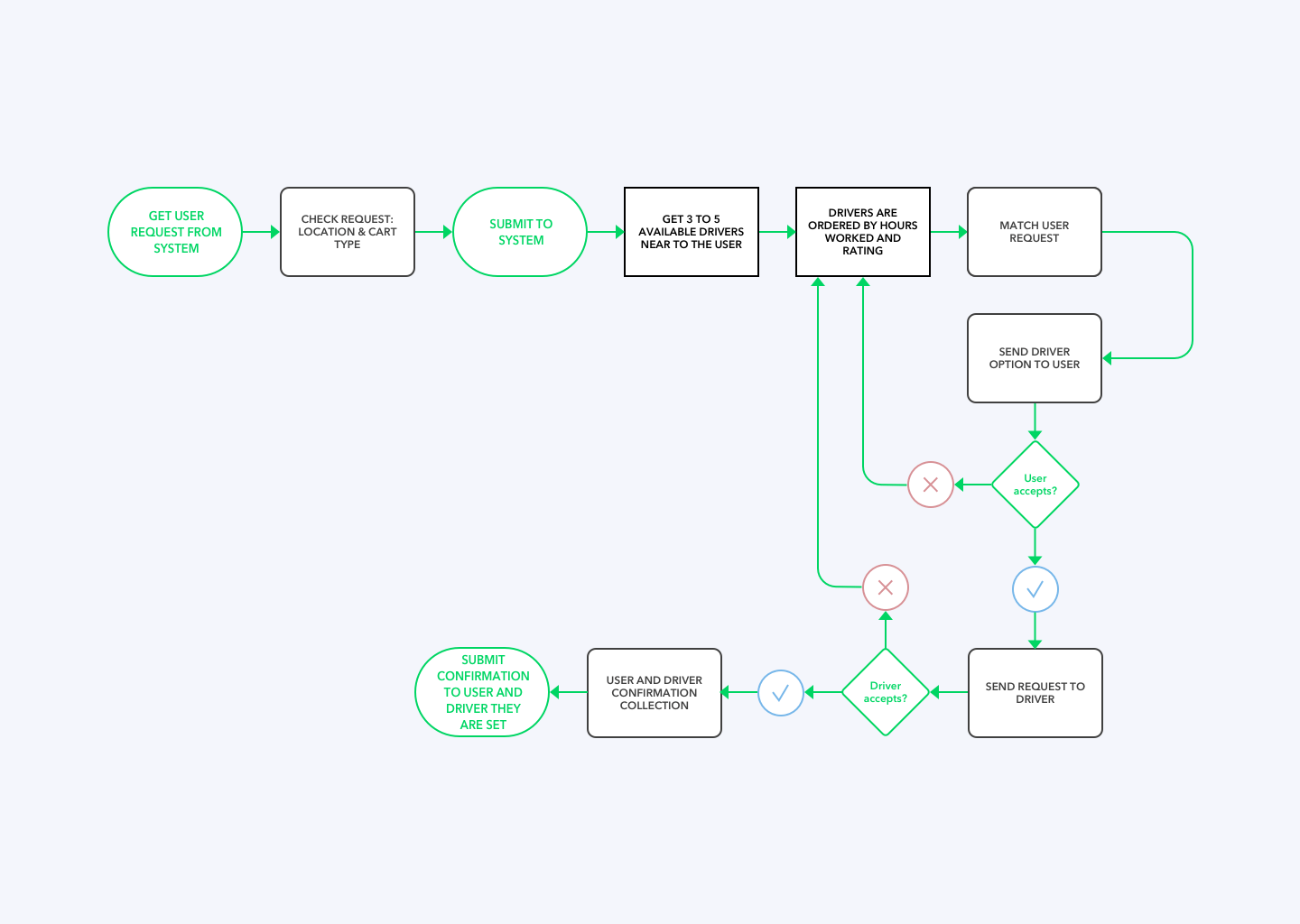
  • does the driver have the correct type of car for the ride type?
  • how far is the driver from the pickup location?
  • has the driver worked much more than all the others? Uber tries to give to all the riders an equal number of rides, if possible
  • what’s the score of the driver?

Userflow

User Interface

Conclusions

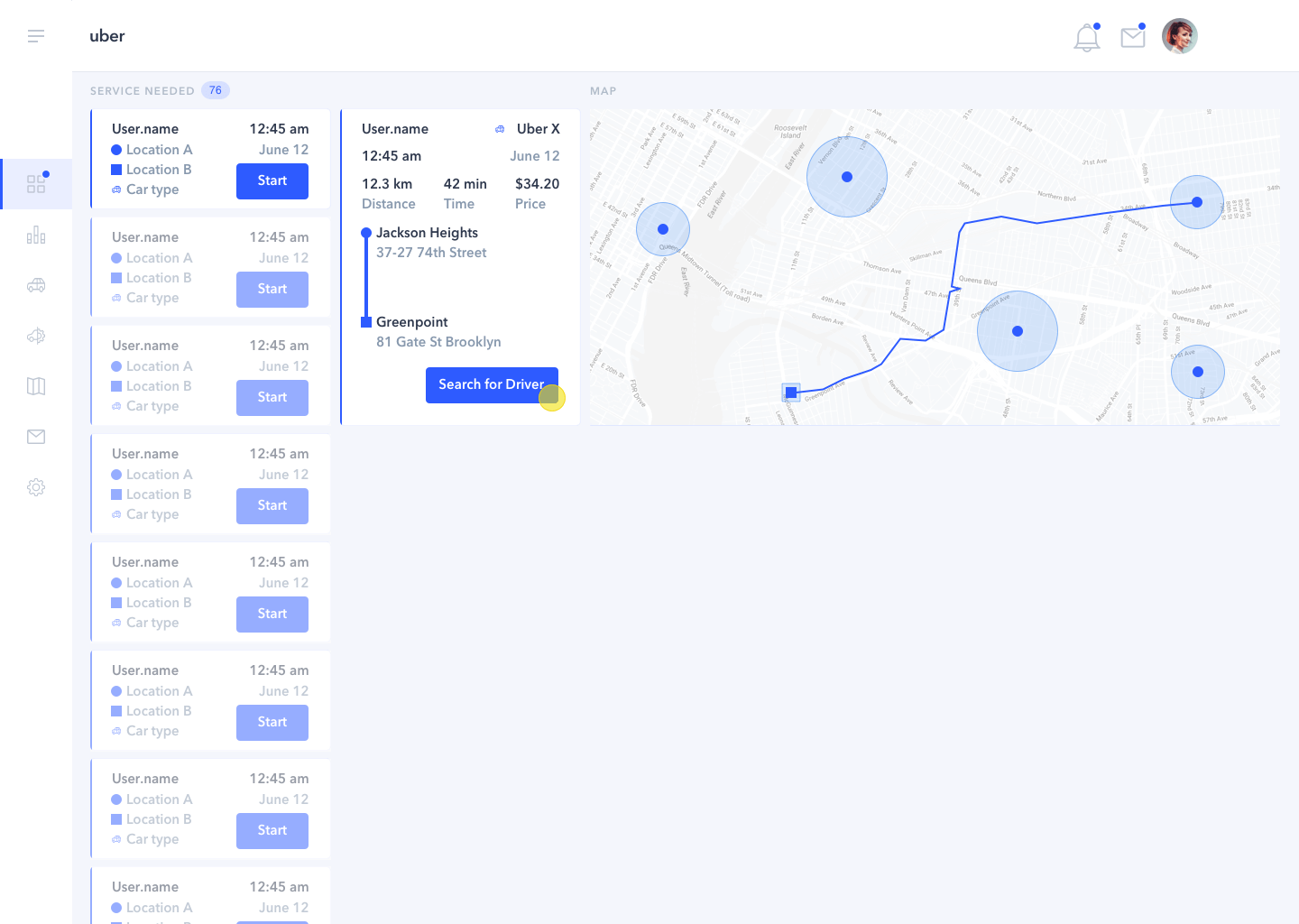
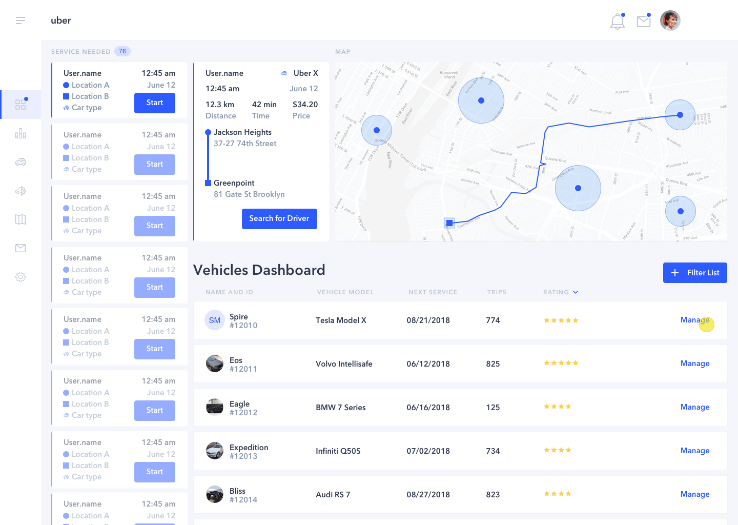
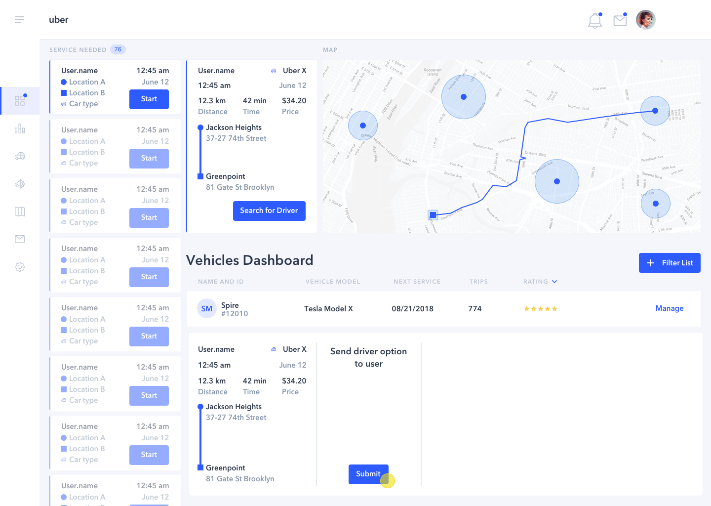
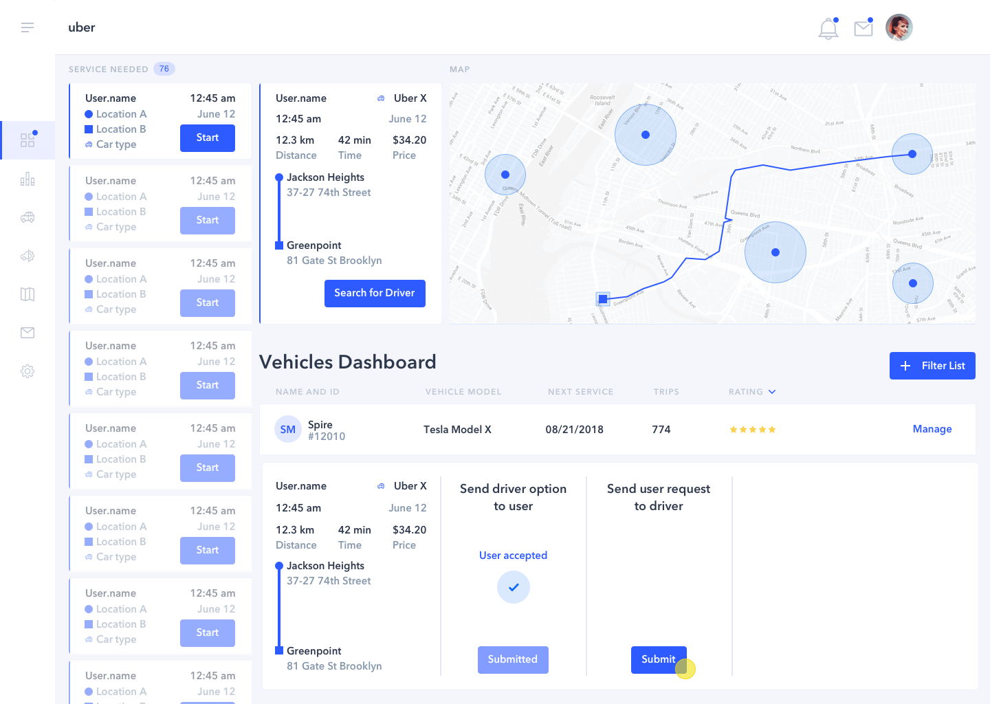
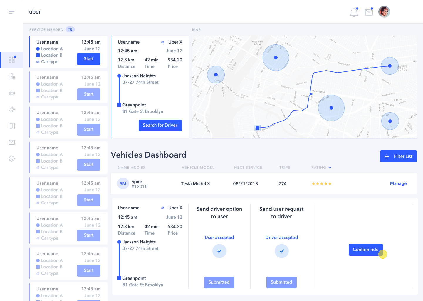
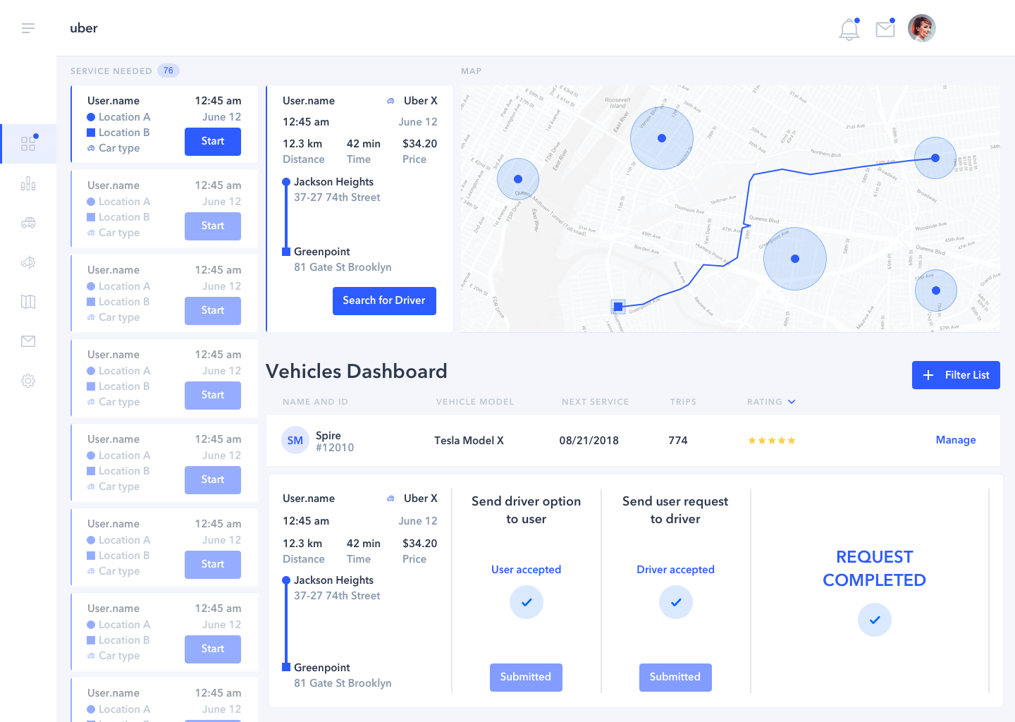
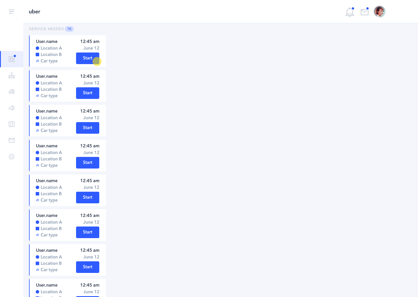
  • As the process has to be fast and accurate, everything is managed in one screen.
  • Request and acceptance process are always visible to Operations team member.
  • Operations team member moves within a platform with a simple and sleek interface.
  • Number of clicks has been reduced to the minimum.
  • It was assumed that the system would help the team member to make the minimum number of choices, to reduce task time and possibility of error.