TrueLayer is the leading technology company providing secure, global access to financial infrastructure.
The goal is to create a new static page for TrueLayer’s website called “Press”. The page should collect links to all the articles out there about TrueLayer.
| Category: | UX/UI Design | Web Design |
I started by analyzing the same type of page on different sites, in different contexts. I determined that 4 elements were needed to develop the "Press" page for this project. The goal is to anticipate everything the media might need.
After the analysis I have developed a page that is a clean and informative Press page, that has the aim to simplify the process of discovery by making it easy for outside sources to publicly recognize the brand. So I obviously included the 4 elements described in the analysis.
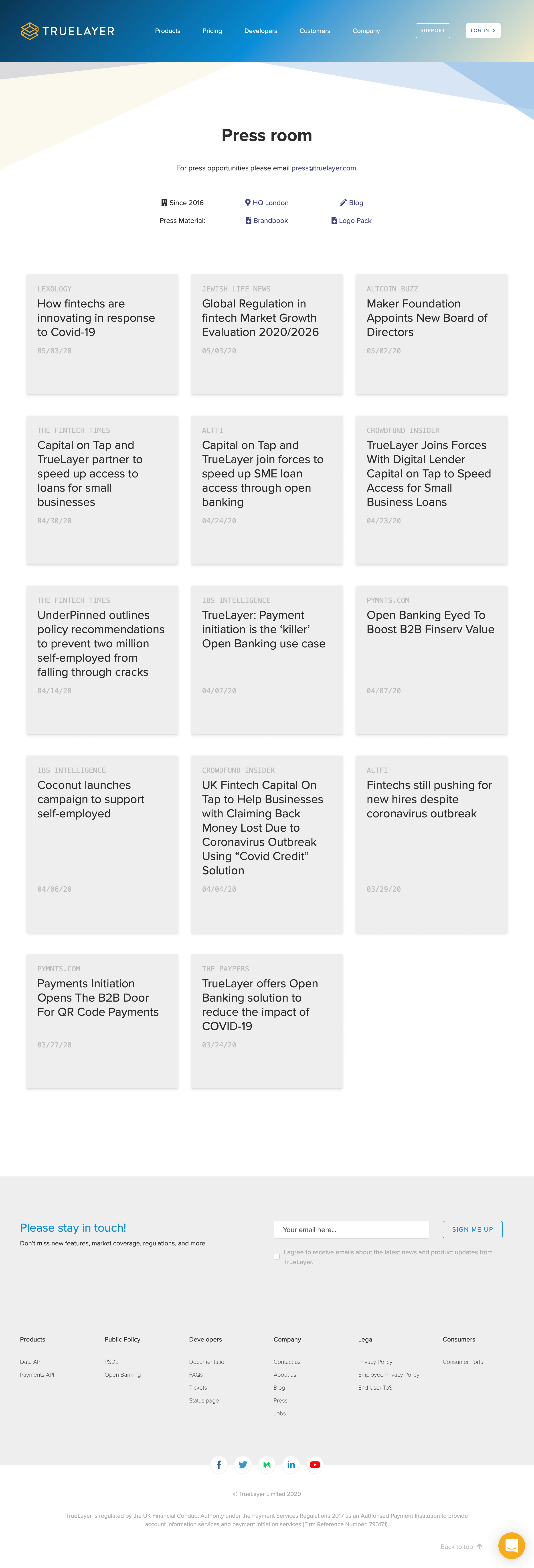
Using the common header of the website, I immediatly highlithed the main informations that could be useful for the media.
After that it comes immediatly a nice and clean grid list of three items per row. Each item includes: publication’s name, the title of the article, and the date.
To give some motion to the page, I added a little animation on hover of the item, using the same used in the website in the Cusotmers page.
I decided on purpose not to insert any "load more" button or any kind of pagination, because I think that since it is a very simple page, the loading performance is not affected, and above all there are no further loadings at the user's click. I kept instead the "back to top" button, which makes it easier for the user to get back on top of the most recent news.
The page ends with the common website footer.
For the libraries used, I opted to use Bootstrap framework. This is because in addition to the fact that it was already included in the site's resources, it is because I consider it one of the most complete and flexible libraries.