Business Case - Casavo

UX & UI DESIGN - UX RESEARCH, ANALYSIS, WIREFRAME & MOCKUP

Project Goal

Casavo is a leading Instant Buyer in Southern Europe, with the aim at making selling and buying a house fast, simple and convenient.
Casavo's website, has a page showcasing the properties that they sell through this platform. Focusing on both UX and UI, the goal is to find issues/pain points that users may encounter when visiting this section of the website. Below, the aim is to find solutions that could create a better user experience.

Category: UX/UI Design

Momentary Online Experience Analysis

To start, I made an analysis of what is state of the art for Casavo properties showcase page, from a UX and UI point of view.
This analysis was made by using as starting point the “10 Heuristics for User Interface Design” by Jakob Nielsen.
What is working well

  • Simple clean layout, no distractions: The overall structure is complete, simple to understand and to manage. The user feels immediately he is going to get the informations he wants in a few clicks. (8th heuristic: Aesthetic and minimalist design)
  • Highlight on properties photos: images represent pefectly the type of property Casavo is selling.
  • Good highlight on price: price is the most highlighted, after photos. For sure this is a very important information for the users using this kind of websites.

What is NOT working

  • Big highlight on map: Map is displayed by default, taking 70% of the horizontal viewport. Properties items are pushed too much aside.
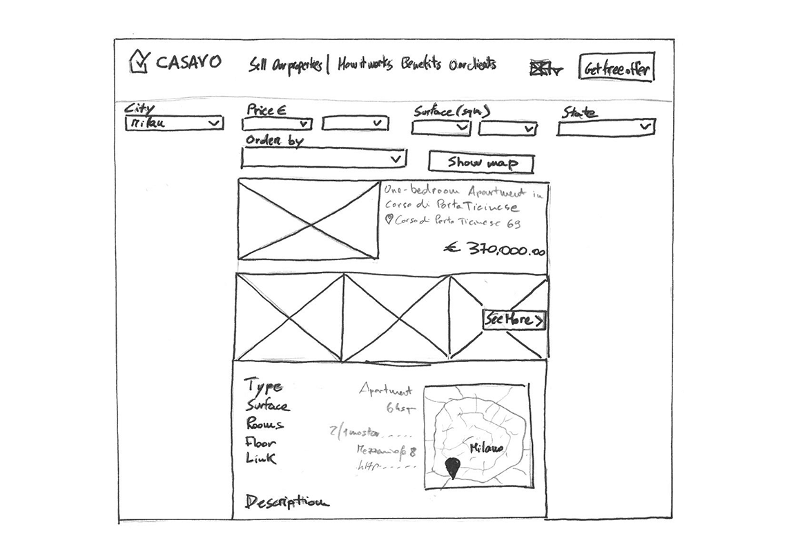
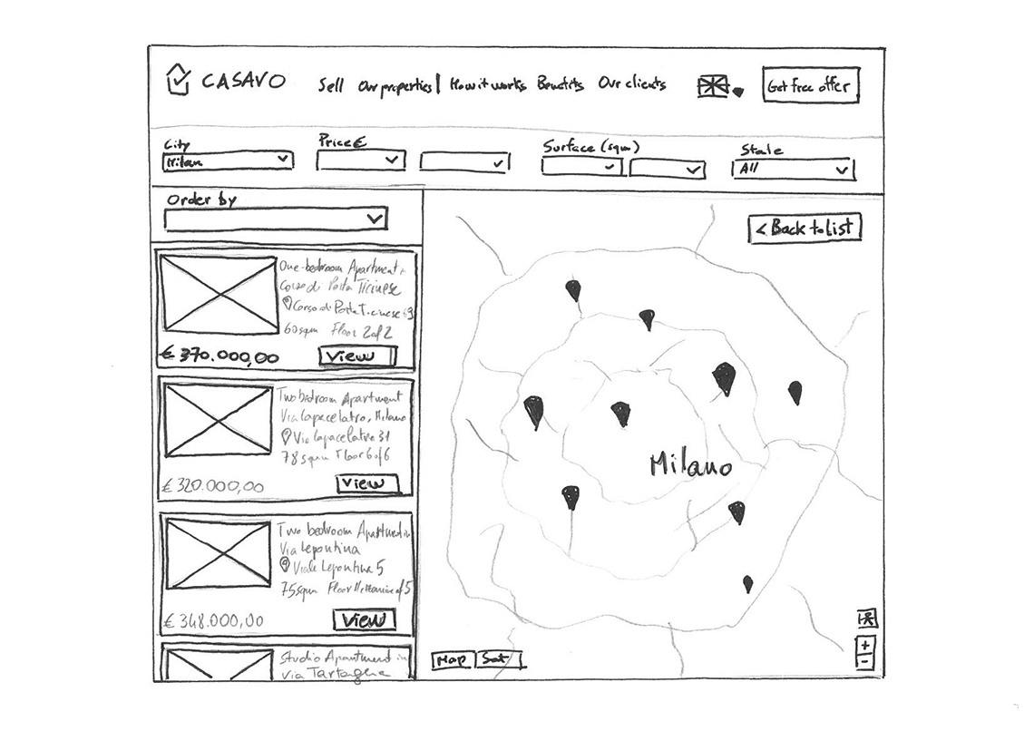
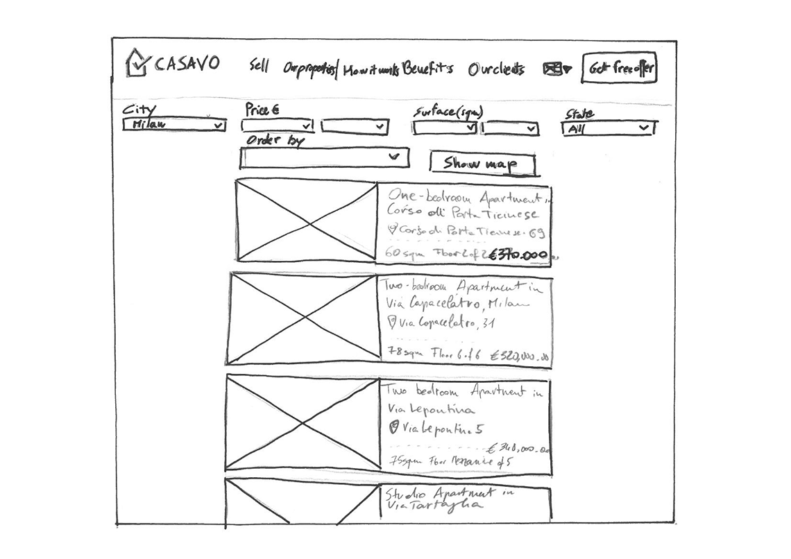
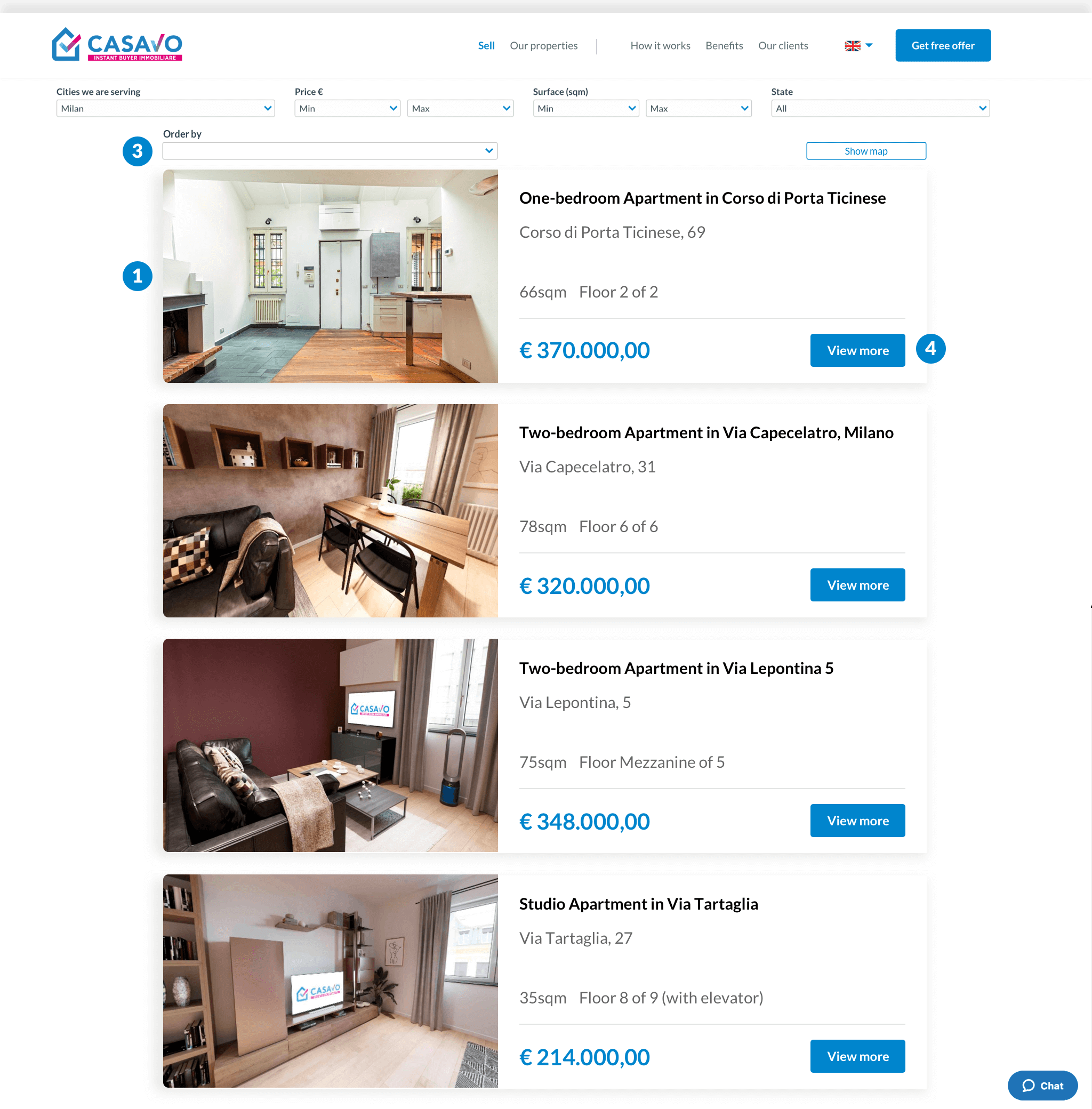
    SOLUTION 1: by default the list of items should by displayed. I suggest to create a list of 1 item per row. On top of it the user can find the button to view the same result set on map. (MOCKUP #1)
  • Go back after click on item: There is no “Go back” function after that user clicks on an item. The only possibility is to use the browser back button, with the downside of losing the filtering setup made before. Also considering that the user may has clicked it, but accidentally. (#3 heuristic: User control and freedom.)
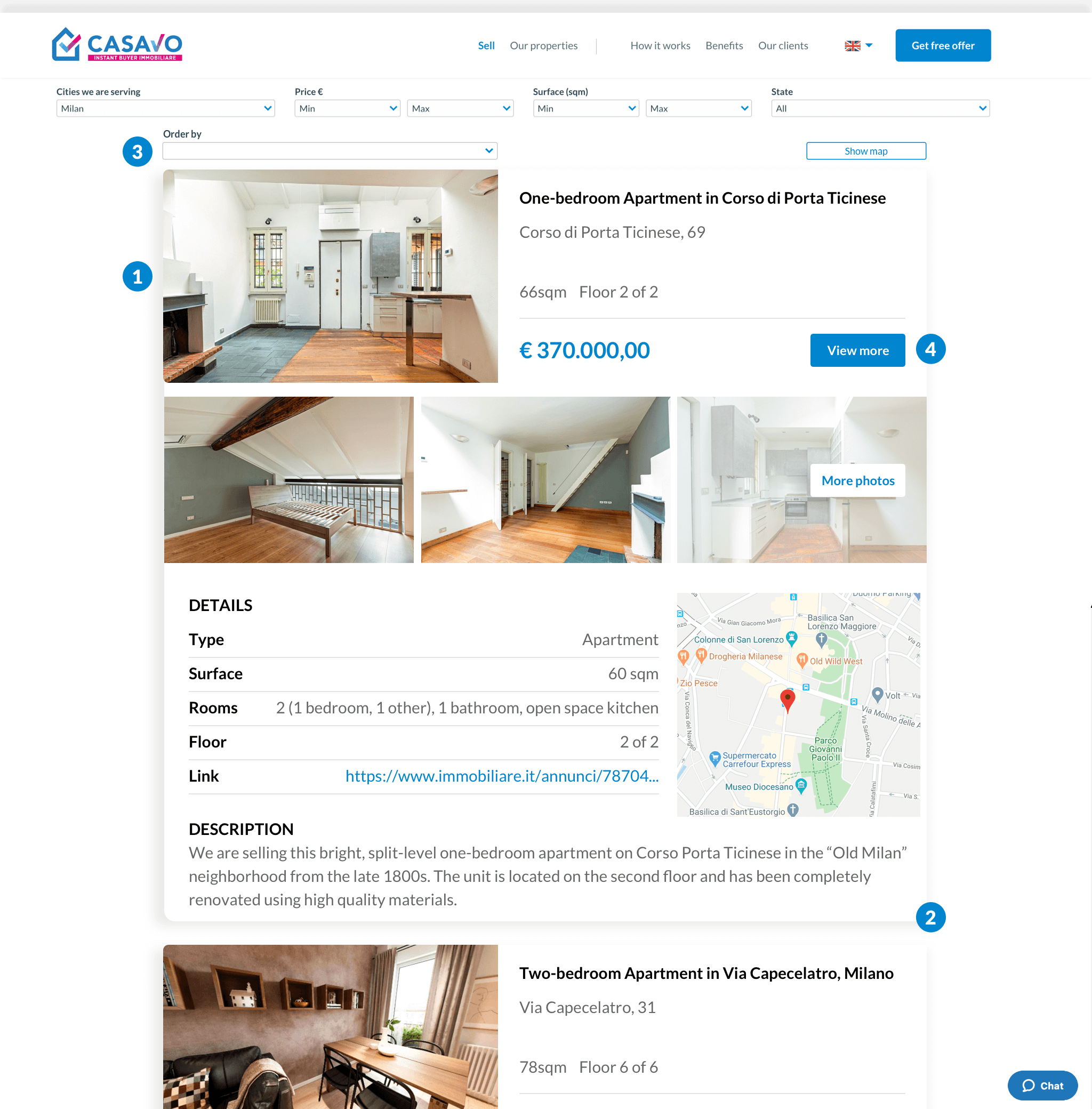
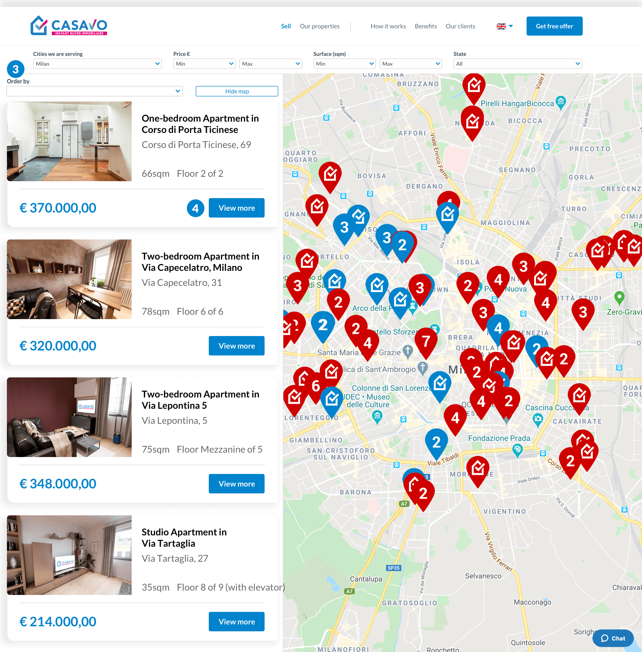
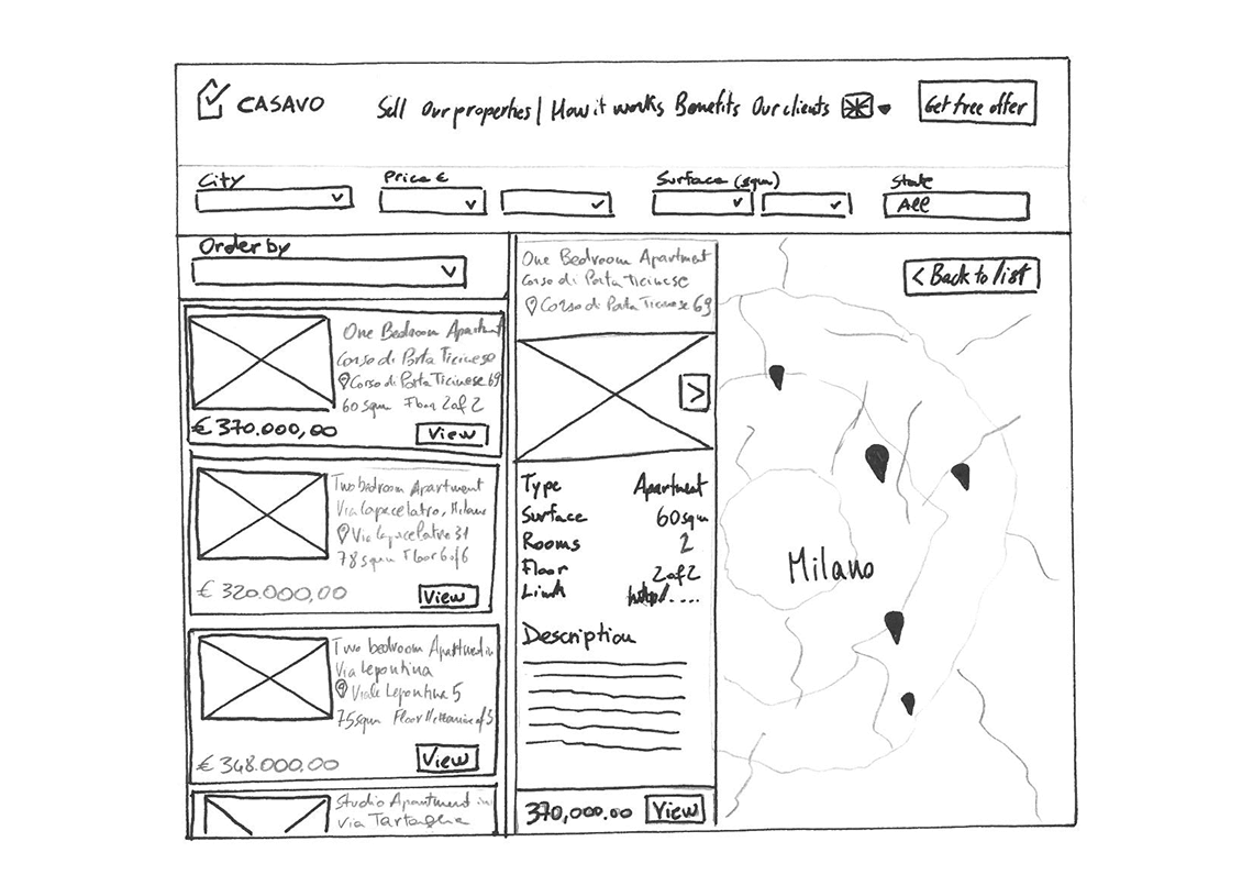
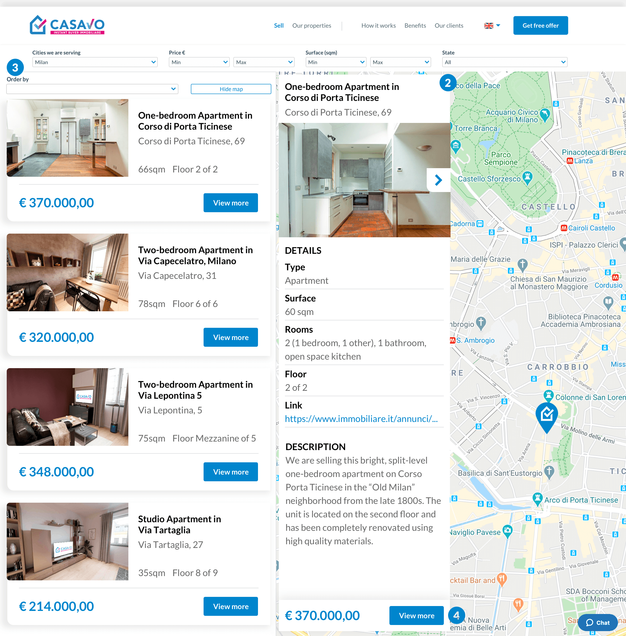
    SOLUTION 2: the solution for this issue coud be, assuming to have a list of 1 item per row, by putting an intermediate step where the item expands vertically (when map is displayed, it expands horizontally) showing a preview of the property. (MOCKUP #2, #4)
  • No ordering options: there is no ordering list option. This could make the user feel lost in find what he is really looking for. (#7 heuristic: Flexibility and efficiency of use)
    SOLUTION 3: adding a dropdown on top of the list of properties, could give more control to the user. (MOCKUP #1, #2, #3, #4)
  • No CTA: there is no CTA for properties. Adding a “View/See More” button with hover effect, could involve the user to click on it.
    There is only one CTA button in the header menu, but on hover the text color is the same of the button, so the user can’t reading it when hovering.
    SOLUTION 4: add CTA inside properties item box could lead the user to click on it. (MOCKUP #1, #2, #3, #4)
  • Pagination: when user uses on the page link at the bottom of the item list, another set of items will be shown, but the page remains in the same position. (#2 heuristic: Match between system and the real world)
    SOLUTION: the easiest solution could be that as soon as the user clicks on a page link, the page will scroll to top.
  • Filtering dropdowns: The dropdowns used to filter the result set, are not customized. Adding some customization could help user to use these filter option understanding their best use. (#5 heuristic: Error prevention)
    SOLUTION: adding some customization to the dropdowns, adding some UI elements (sliders, icons) could help the user understanding the most effective way to use them.

Mockup #1

Mockup #2

Mockup #3

Mockup #4