Preliminary task
UX analysis on SuperEnalotto App.
Focus for analysis
Analyse and describe the TOP 5 serious usability and accessibility issues found in App.
Elements to consider
- The App is not native
- Consider that the bet slip and receipt are delivered as iframes and are the same between the App and the Sisal.it portal
- The average age of the SuperEnalotto retali player is between 35-65 years old
UX analysis
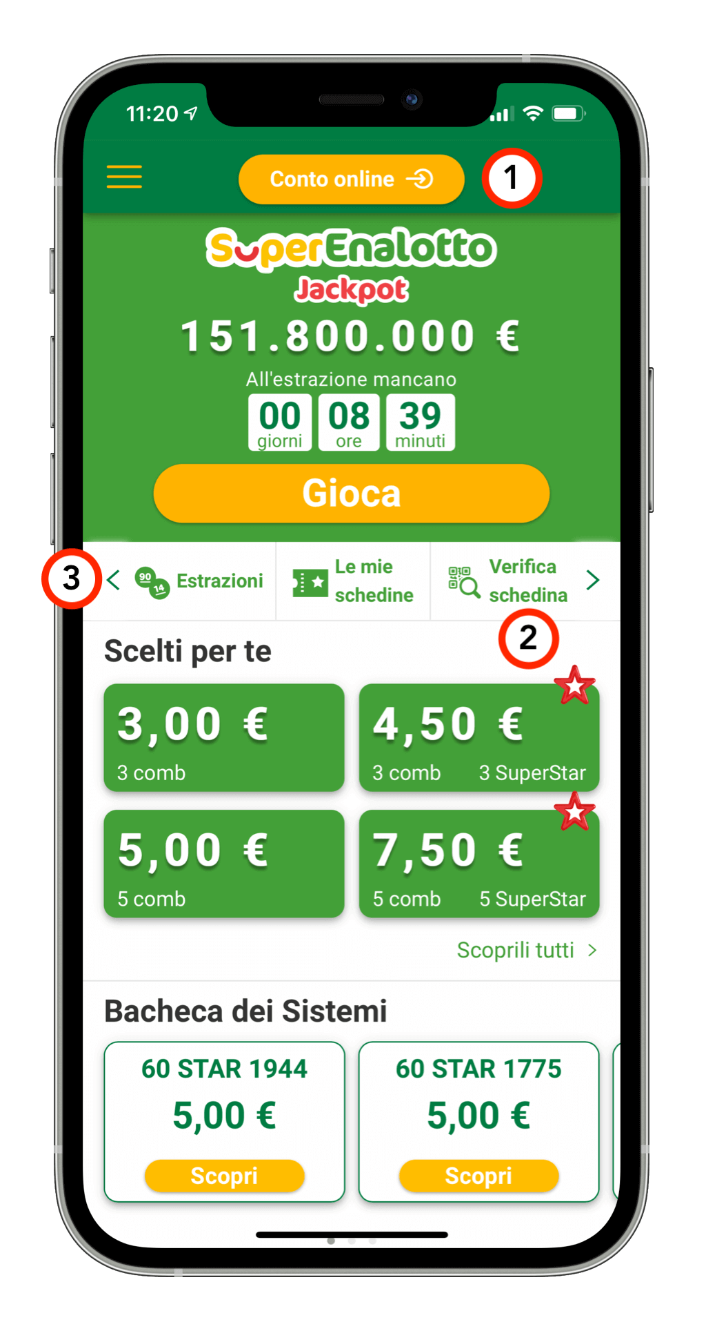
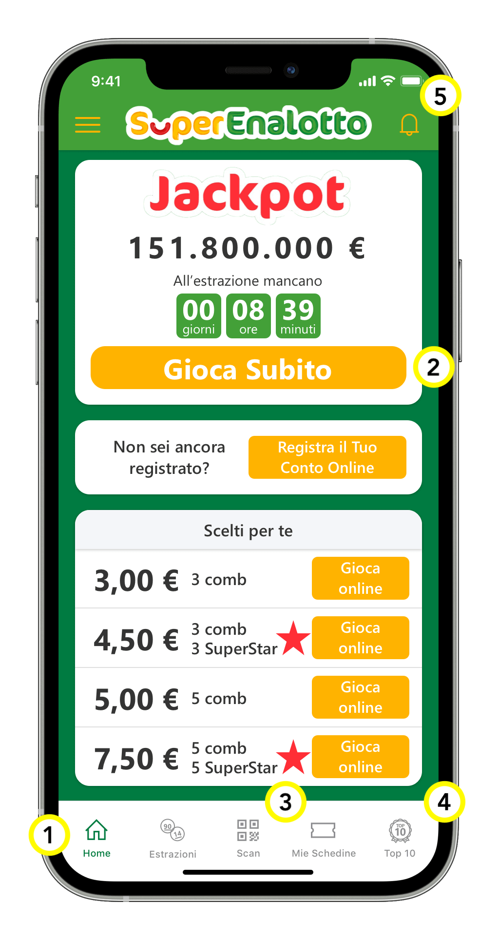
- The ''Online account'' button is positioned in one of the most difficult places for the user to reach [see thumb rule]
- In view of the fact that 70% of users use the App to check their winnings, it is necessary to place the link in a more visible position
- The central section with shortcuts to the most used sections does not highlight in any way when there is other content to see on the right or left. Moreover, the arrows are always visible even when you have already reached the limit
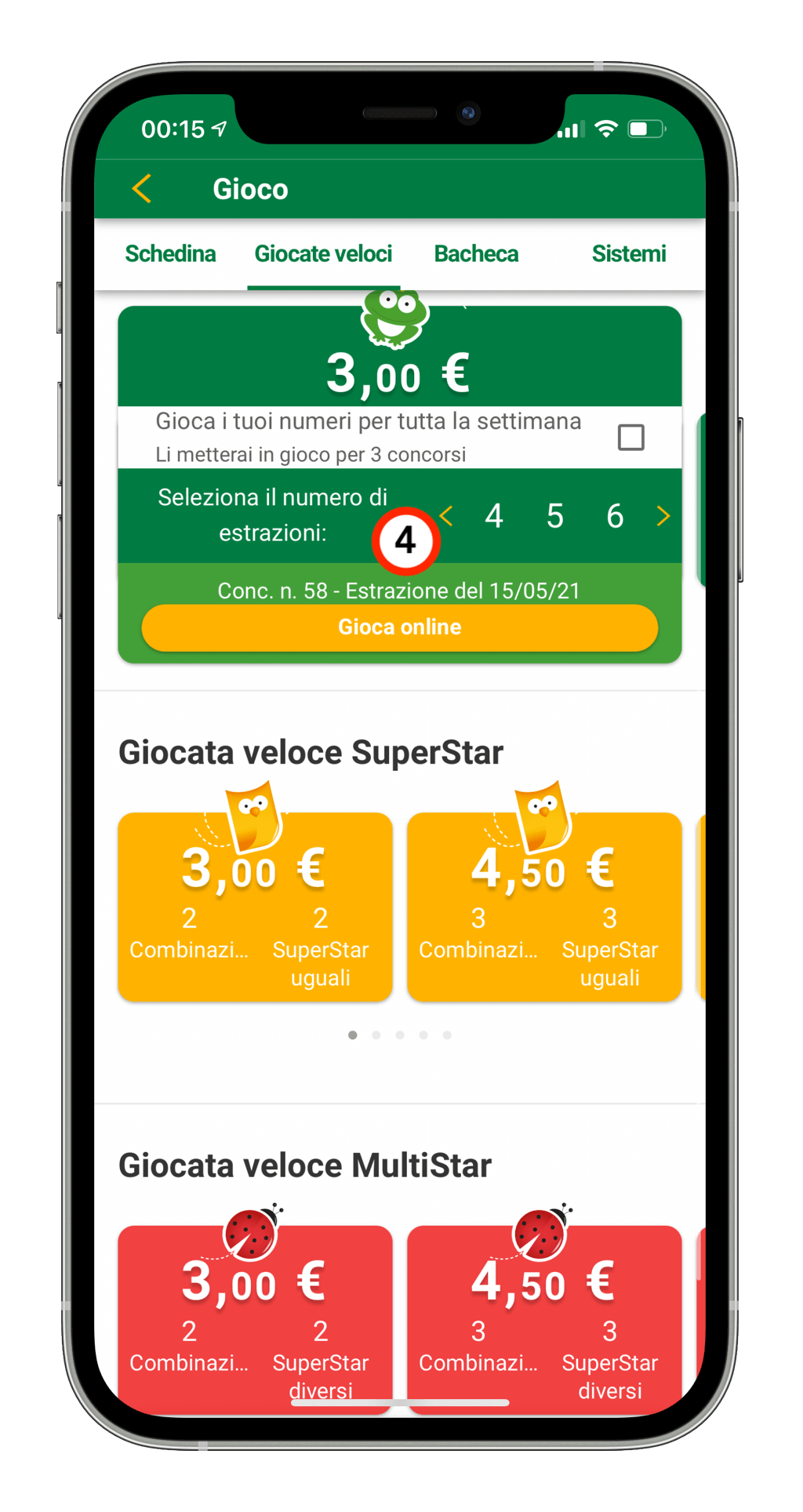
- In the ''Quick Plays'' screen, the slider for setting the number of draws leaves the user with very little control over their options. This pattern is also repeated in other parts of the app
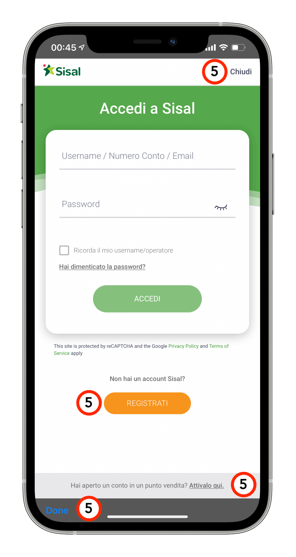
- The hierarchy of buttons and information in the login form could be very confusing for the user: especially if the user is not registered or if he wants to activate an open account in the betting shop. In addition, there are several controls to terminate the registration or access, managed in a completely different way, displayed with the label ''Close'' and ''Done''
Main task
Simplify the experience of entering the game and opening a game account on the SuperEnalotto App.
Goal of the new experience:
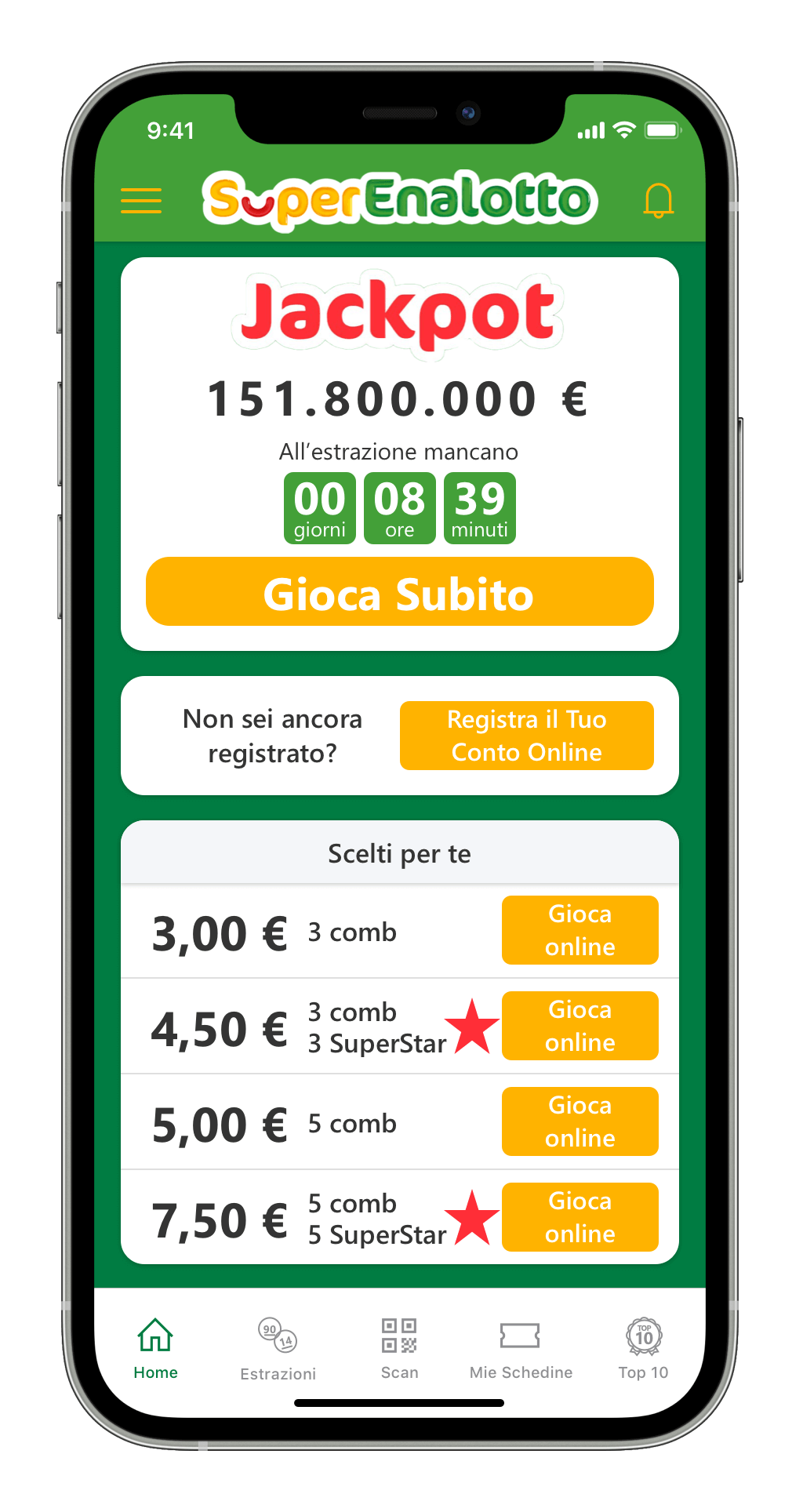
The business need is to restructure the Home Page of the SuperEnalotto App, in order to simplify the experience for customers coming from a retail context and to facilitate access to opening the game account with the Sisal.it retailer.
Elements to consider
- Information about the jackpot and how much is left until the draw is important information for users
- Currently 30% of SuperEnalotto online play comes from the SuperEnalotto App
- 70% of SuperEnalotto app users use it to check their winnings without opening an account
UX analysis
Criticalities
- Lack of quick actions to reach the most used actions by users
- The ''Online account'' button is positioned in one of the most difficult places for the user to reach [thumb rule]
- Given that 70% of users use the App to check their winnings it is necessary to place the link prominently
- Poor visibility of the various quick links (''Draws'', ''My tickets'', etc.)
- Lack of evidence for any alerts to be shown to the user
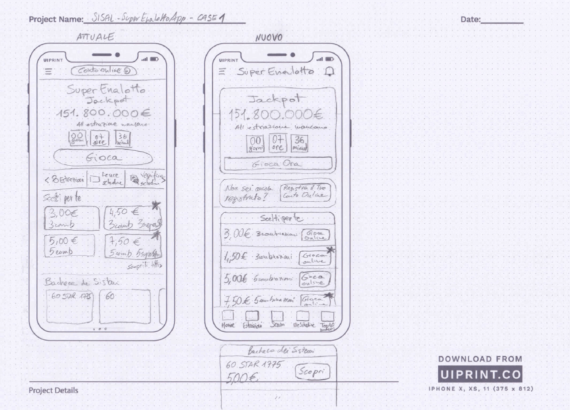
Solutions
- Add the Tab Bar component at the bottom of the screen with the main sections of the App
- Place the CTA for creating the account in an easily accessible position, enriching the context in which it is inserted
- Place ''Check slip'' in the centre of the Tab Bar
- Place the links in the Tab Bar
- Place the alert icon in the top right-hand corner, for the collection of notifications (verification of responsible gaming provisions)