Trivago Magazine is a website, that has a homepage that consists of different content modules of which each acts as an entry point leading to a full page article, followed by related articles.
Focusing on both UX and UI, the goal is to propose an evolution of the homepage experience that aligns both desktop and mobile experience.
| Category: | UX/UI Design |
To start, I made an analysis of what is state of the art for trivago Magazine, from a UX point of view.
This analysis was made by using as starting point the “10 Heuristics for User Interface Design” by Jakob Nielsen.

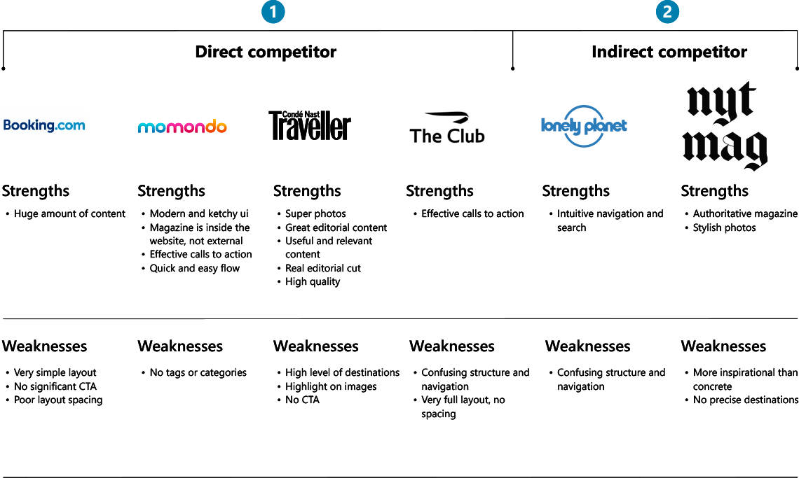
After trivago Magazine anlaysis, I performed a web search to analyze the competitors, their features and the characteristics of their sites, to understand how and where to insert and position trivago Magazine. I performed several tests, testing most of the features offered. The competitor analysis was directed towards five competitors, more or less famous and more or less complete.
Below is a summary of the competitor analysis broken down by area. To get this I have used part of the SWOT analysis framework.

In this step, I would try to get an idea of the target audience and habits of the site's users. I would send a survey (made with Google Forms or Survey Monkey) with 10 to 15 generic questions to extrapolate quantitative data to 35/50 people hypothetically targeted. From the survey I would send, I would be able to extrapolated interesting data that could. give a first statement of the users that use trivago Magazine.
Once analyzed the survey data, I would performe a minimum of 5 interviews for qualitative data useful to identify the target audience and from which I would create the user persona.
Using the interviews, I will be able to create 2 or 3 user persona, that will represent specific target users rather than using a generic one. I will have a simple representation of the most common target audience. It’ll help to standardise needs and get solutions faster.

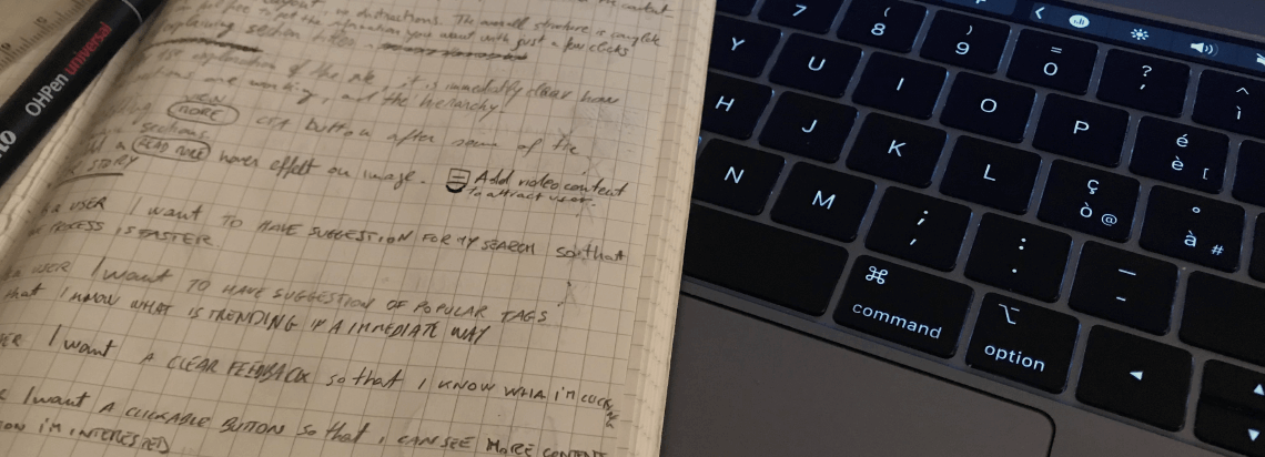
After User Persona, I would write down some user stories, that are short statements or abstracts that identifies the users and their needs or goals. It determines who the users are, what they need and why they need it.
Here are some examples:
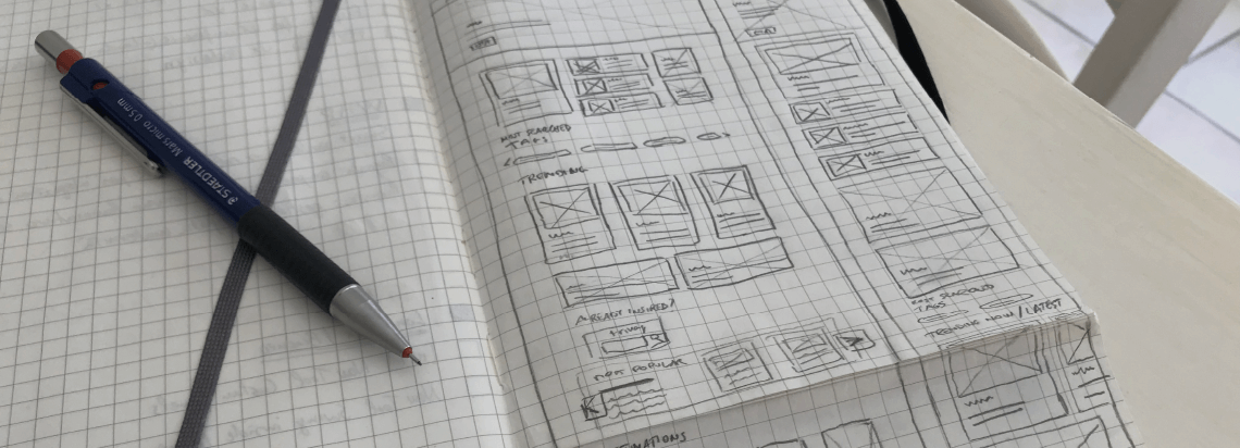
After finishing the first part dedicated to user research I would start developing some wireframe on paper for the main features of the homepage. After outlining the basic structure of wireframes I will design the wireframes with Sketch software.


A usability test coul be conduct using the site's low-fidelity prototype.
The test has the aim to assess the usability, navigation and clarity of the contents related to the designed navigation, in order to identify errors, get feedback from users and evaluate the overall success of the prototype.
The participants chosen for the test would be the same ones who carried out the interviews. The results generated could help to identify critical areas to improve user interaction and identify errors.
After the collection of the feedbacks, I will have the possibility to change the prototype, and make the changes were needed.
If needed it is possible to have another cycle of iteration and correction, till the prototype has no errors anymore.
Once the final wireframe has been created, it is possible to define the new User Interface of the website.
This must also follow all the indications that have emerged from the UX analysis.
After the definition of the UI for all the components, it’s possible to realize a full functional mockup.
At this point, it is possible to realize a full functional test using the mockup, to check the final version.