Business Case - Docebo Dashboard

UX & UI DESIGN - WIREFRAME & MOCKUP

Project Goal

Docebo is a software as a service learning management system. Established in 2005, Docebo offers a learning portal for companies and their employees, partners and customers.
Focusing on both UX and UI, the goal is to design a great and engaging e-Learning dashboard where users can check their learning activities performed in the company’s training platform.

Category: UX/UI Design

Assignment

Who

Julia – 30 years old - Sales Representative


What

PRO

  • Hard worker
  • Demonstrating improvements
  • Receiving guidance in career development
  • Having overview of how she is doing in performance

CONS

  • Knows her gaps knowledge
  • Needs guidance
  • Not easy to demonstrate achievements
  • Not easy see her progress


How

  • Proof of achievements is important for her
  • Actively pursues learning opportunities
  • New courses that can improve her skills
  • Important to quantify and demonstrate her new skill set
  • Clear overview of her progress
  • Being able to demonstrate her progress

Target

Design a great and engaging e-Learning dashboard where Julia can check her learning activities performed in the company’s training platform.
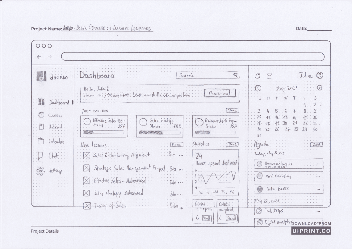
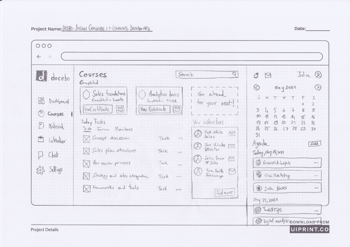
Wireframes

User Interface

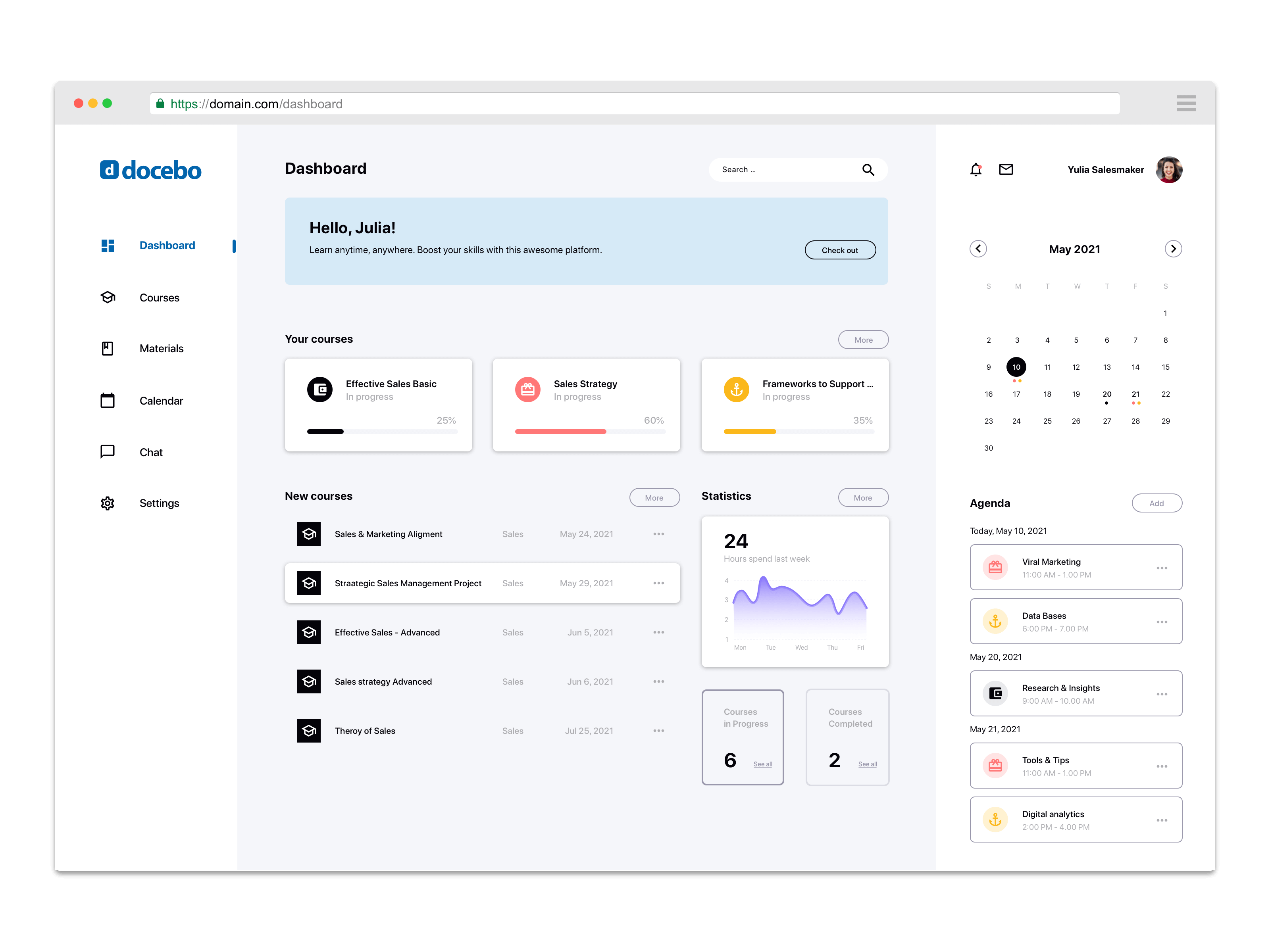
DASHBOARD

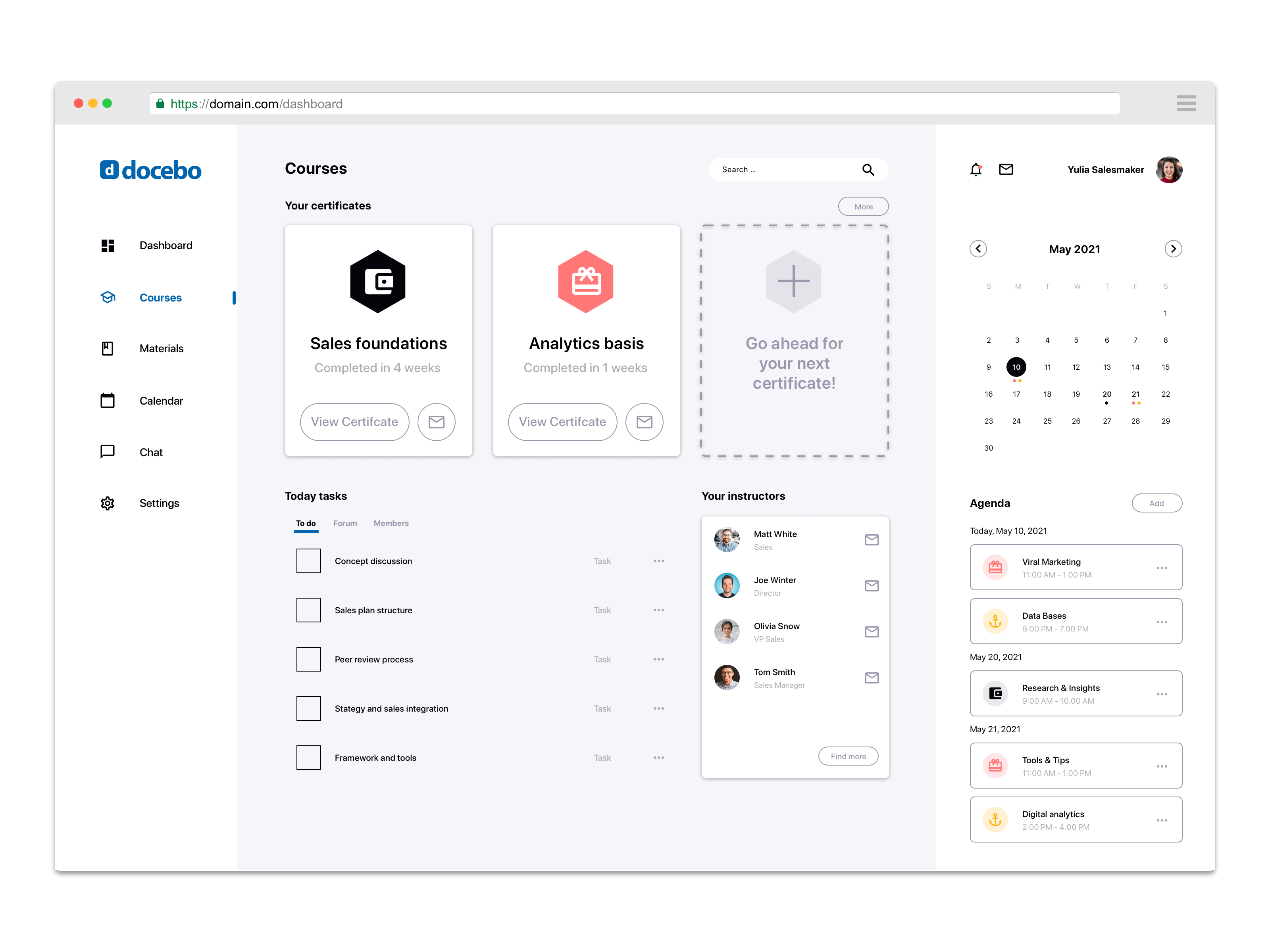
COURSES

Conclusions

DASHBOARD

  1. Engaging CTA to trigger user finding new courses
  2. A clear view on what are the new and suggested possibility for the user
  3. A standing out overview of the progress and the achievements

COURSES

  1. Possibility to access easily the achieved certificates
  2. Ability to share and demonstrate her progress in developing new skills
  3. Engaging elements to work hard for more achievements
  4. Chance to contact the course instructors for guidance or any help