Business case · UX research and UI
trivago Magazine
trivago Magazine is an inspiration layer bolted onto a price-comparison engine, and it showed: beautiful content with no path back to booking. I audited the homepage against Nielsen’s heuristics, benchmarked six competitors, and rebuilt the page as a sequence that ends in a search box.
- Type
- Self-directed business case, a brief taken on during a design selection process and run with my own method
- Scope
- Heuristic audit, competitor SWOT, user stories, wireframes, UI direction
- Surfaces
- Desktop and mobile homepage
- Tools
- Paper, Sketch
The brief
trivago Magazine is a website whose homepage is a stack of content modules, each acting as an entry point into a full article, followed by related articles. The brief: propose an evolution of the homepage experience that aligns desktop and mobile.
The interesting tension is commercial. A magazine attached to a hotel search engine exists to create intent, but the version I audited gave inspired readers almost nothing to do with that intent.
The process, and what was real
Two of the five phases are honest gaps. I had no access to trivago’s users or analytics, so the research plan below is written as a plan, not dressed up as findings.
Empathise
Partly delivered- Heuristic evaluation of the live homepage
- Competitor SWOT across six players
- Survey with 35 to 50 respondents (proposed)
- Five in-depth interviews (proposed)
Define
Partly delivered- Strengths and weaknesses synthesis
- User stories
- Two or three personas from interview data (proposed)
Ideate
Delivered- Paper sketches of the homepage modules
- Content hierarchy for desktop and mobile
Prototype
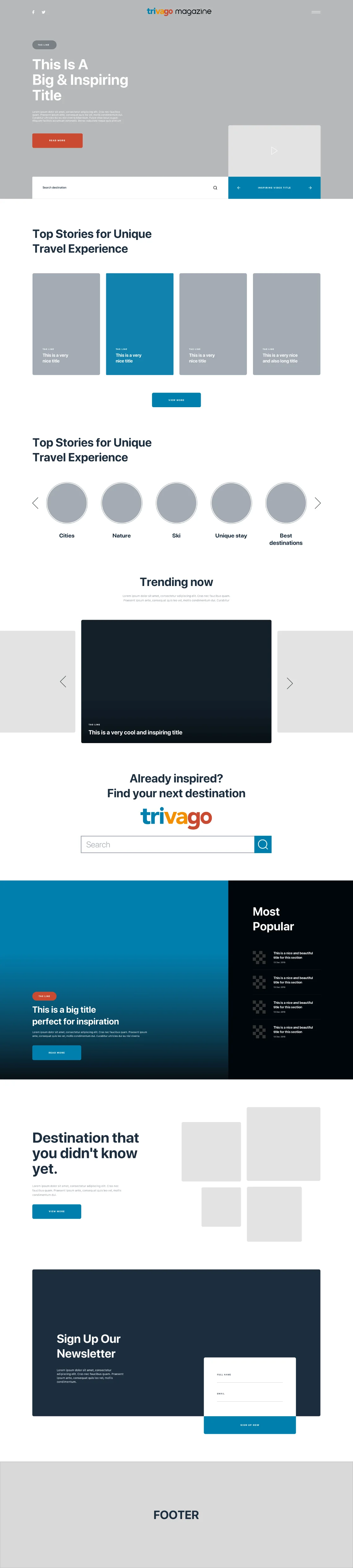
Partly delivered- Full-page wireframe in Sketch
- Clickable prototype (proposed)
Test
Method proposed- Usability test on the low-fidelity prototype (proposed)
- Iterate and re-test until the flow is clean (proposed)
- Visual design and final mockup (proposed)
Heuristic audit
Delivered
I started where it is cheapest to start: a structured walk of the live homepage using Jakob Nielsen’s ten usability heuristics as the checklist. Naming the heuristic each time keeps the review from becoming a list of personal preferences.
What works
- Evocative imagery. Photography matches title and context, so the reader knows what they are about to get.
- Clean, undistracted layout. Simple structure, and the reader feels a few clicks away from what they want.
- Self-explaining section titles. After one pass the sections and the page hierarchy are obvious.
What doesn’t
- Search has no autocomplete and no error tolerance.
- The embedded trivago search engine is given no emphasis at all.
- Tags look like stray buttons rather than tags.
- The palette is grey, under a famously colourful logo.
- Content blocks have no call to action.
- No way to load more of a section without leaving the page.
- No video, so the page reads static.
- No invitation to subscribe to anything.
- Search punishes typos
Autocomplete is missing, so a mistyped destination gets the user nowhere and offers no recovery. The recommendations shown instead are featured content, not answers to the query.
5th heuristic: error preventionFix
Autocomplete on destinations and tags, with a forgiving match and a visible “did you mean” path. - The money component is invisible
The embedded trivago search engine gets no emphasis, even though it is the one module that converts inspiration into a booking.
Fix
Give it a full-width band of its own, placed after the reader has been inspired rather than before: “Already inspired? Find your next destination.” - Tags don’t look like tags
Tag buttons sit in the middle of the page with no visual energy and read as generic buttons, so nobody uses them to explore.
2nd heuristic: match between system and the real worldFix
Treat them as topic chips with imagery and a hover state, grouped under an explicit “trending” label. - Content has no next step
Only the top component carries a call to action. Every other block asks the reader to guess that the image is clickable.
Fix
A “Read more” affordance with a hover state on every card, plus a “View more” that loads the rest of a section in place instead of navigating away.
Competitor benchmark
Delivered
I then tested six competitors hands-on, four direct and two indirect, and summarised each on the strengths and weaknesses axes of a SWOT. The point was positioning: where does a hotel comparison engine’s magazine sit between a booking site’s content arm and an actual travel magazine?
What the benchmark settled
momondo was the only player with the magazine inside the product rather than parked outside it. That became the structural argument for pulling the trivago search engine into the middle of the page instead of leaving it at the edges.
The research I would run
Method proposed no access to trivago’s users on a selection exercise
This is the part of the process I could not execute, and I would rather show the plan than pretend I had the data.
- Survey. Ten to fifteen questions to 35 or 50 people in the target audience, for quantitative signal on who reads the magazine and what they do next.
- Interviews. A minimum of five in-depth sessions for the qualitative half: how travel inspiration actually turns into a booking decision, and where it dies.
- Personas. Two or three built from that material, not from imagination. Specific targets beat one generic reader, and they make later trade-offs faster to settle.
From findings to user stories
Delivered
With the audit findings in hand I wrote the requirements as user stories: short statements of who wants what and why. They are the bridge between a list of complaints and a page structure, and they are testable later.
- As a user I want suggestions for my search so that the process is faster.
- As a user I want suggestions of popular tags so that I know what is trending immediately.
- As a user I want clear feedback so that I know what I am clicking on.
- As a user I want clickable buttons so that I can see more content in a section I care about.
- As a user I want a highlighted search engine so that I have direct access to results.
Wireframes
Delivered
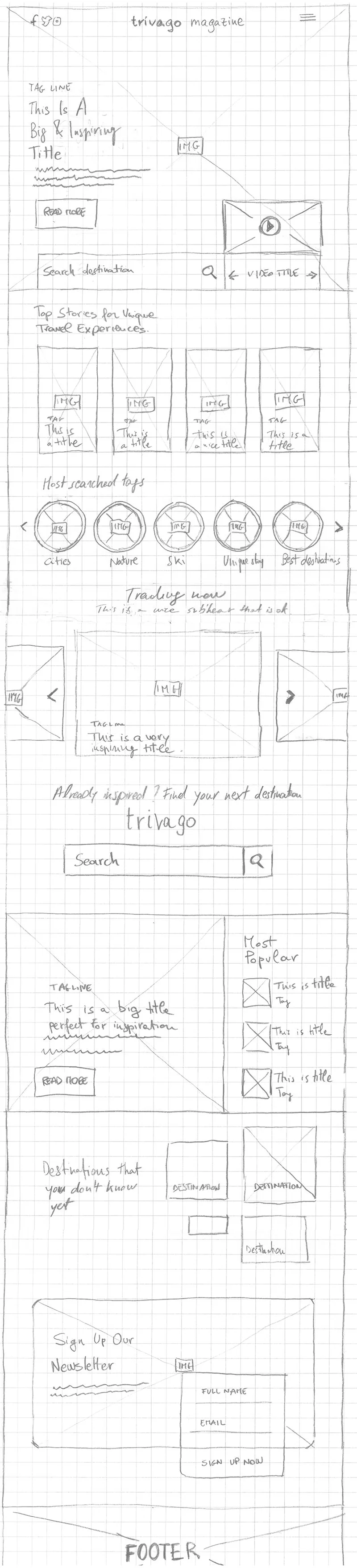
Paper first. Squared paper, one module per block, so that rearranging the page costs nothing and the argument stays about sequence rather than styling.
The one decision worth arguing about
Putting the search engine in the middle of the page, not the top. A reader who arrives at a magazine is not in a buying moment. A reader who has just finished an article about Lisbon might be. Sequence is the design here.
Prototype, test, then interface
Method proposed
The remaining phases were planned, not run. In order: build a low-fidelity clickable prototype and test it with the same people interviewed earlier, assessing navigation and content clarity; correct the prototype and iterate until the errors stop appearing; only then define the interface, working from what the audit demanded (more colour, genuine calls to action, tags that look like tags); finally, a functional mockup and a last pass of testing before handover.
Written out like this it looks tidy. In practice the second iteration is where the structure usually breaks, which is exactly why I would not skip ahead to visual design.
Looking back
Method proposed written now, looking back: what I would keep and what I would do differently with the experience I have today
The audit and the benchmark are still work I would defend. Naming the heuristic behind each finding is what made the recommendations arguable rather than decorative.
What I’d change is the ambition. I redesigned an entire homepage when the commercial problem was one module, the search band. Today I would scope this as a single measurable change, propose it as an experiment with a defined success metric, and keep the full-page redesign as the follow-up if the experiment paid. I would also stop writing “the user” in user stories: without personas behind them, that phrase quietly means “me”.